Beyond Numbers: Making Your SEO Data Pop

SEO data visualization: Boost 2025 ROI!

Why SEO Data Visualization Transforms Your Business Results

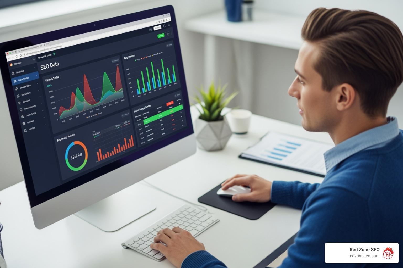
SEO data visualization is the process of turning raw SEO metrics into clear charts, graphs, and visual reports that reveal patterns, trends, and opportunities at a glance. Instead of drowning in spreadsheets, you get instant insights that drive better decisions and demonstrate real business value.

Quick Answer for Creating SEO Data Visualizations:

  1. Choose your key metrics - organic traffic, keyword rankings, conversions
  2. Select the right tool - Looker Studio (free), Tableau, or Excel
  3. Pick appropriate charts - line charts for trends, bar charts for comparisons
  4. Connect your data sources - Google Analytics, Search Console, SEO tools
  5. Focus on storytelling - highlight wins, identify problems, show ROI

The human brain processes visual information 60,000 times faster than text. Yet many SEO reports are still delivered as mind-numbing spreadsheets that hide the real story. As one expert noted, "Poring through pools of numbers can be tedious and mentally exhausting." Visual presentations are essential for getting executive buy-in.

When you show a client a spreadsheet of keyword rankings, their eyes glaze over. But show them a colorful dashboard with their organic traffic climbing month over month? Now you have their attention. Data visualization makes complex SEO data easier to digest and more interesting. It helps you spot trends you'd miss in raw numbers, turns boring reports into compelling stories, and connects your SEO work to real business outcomes.

For any business trying to compete online, this isn't just nice to have—it's essential. You need to prove your SEO investment is working, identify which strategies drive results, and communicate your wins in a way that motivates continued investment.

Infographic showing the key benefits of SEO data visualization including faster pattern recognition with the human brain processing visuals 60,000x faster than text, improved stakeholder communication with 53% of marketers using data visualization for SEO promotion, better decision making through trend identification, and increased ROI demonstration with visual reports driving more buy-in than spreadsheets - SEO data visualization infographic

The "Why" and "What" of Visualizing SEO Data

Our brains are visual creatures, processing images 60,000 times faster than text. Yet, many SEO reports are still presented as dense spreadsheets, causing audiences' eyes to glaze over. The data is there, but the story gets lost. This is where SEO data visualization becomes your secret weapon.

When you transform overwhelming datasets into intuitive charts and graphs, something magical happens: suddenly, everyone gets it. Your team sees the wins, clients understand the value, and your boss approves the budget. It's not just about making pretty charts; it's about turning complex performance data into clear, actionable insights that justify your SEO Packages Pricing and demonstrate ROI.

What is Data Visualization in an SEO Context?

SEO data visualization is the art of translating numbers into stories. It takes unstructured data from tools like Google Analytics and Search Console and converts it into visual charts that provide quick insight. Instead of showing 500 rows of keyword data, you show a colorful chart where green arrows point up for wins. The goal is to make your SEO data accessible and highlight the most relevant information, creating compelling reports that engage stakeholders.

As Search Engine Journal explains, data visualization places your data in a visual context to communicate insights with clarity. For a deeper dive, check out this guide: What Is Data Visualization And How To Use It For SEO.

Why Raw Numbers Aren't Enough

Staring at endless spreadsheets is inefficient and often counterproductive. Raw data creates several critical problems that visualization solves:

  • Data Overload: With data from Google Analytics, Search Console, and other SEO tools, important insights get buried under the sheer volume of information.
  • Tedious Analysis: Poring through numbers is mentally exhausting and time-consuming. What should take minutes to understand can stretch into hours.
  • Lack of Narrative: Numbers alone don't explain why something happened. Context gets lost, and without it, data is just noise.
  • Hidden Trends: A gradual decline in traffic over three months might be invisible in a spreadsheet but would jump out immediately on a line graph.
  • Failure to Persuade: Raw numbers fail to convince stakeholders. A clean dashboard connecting SEO work to revenue growth speaks their language and proves how your SEO Content Strategies are performing. Raw numbers are the ingredients; data visualization is the chef who turns them into a nourishing meal.

From Spreadsheets to Stories: Key Metrics and How to Visualize Them

Instead of drowning clients in numbers, imagine pulling up a dashboard that tells the complete story of their SEO success. That's the power of SEO data visualization—turning data into compelling narratives. The secret is choosing the right visual for each story, following a simple rule: clarity beats complexity every time.

Line chart showing a clear upward trend in organic traffic over time - SEO data visualization

Visualizing On-Page and Technical SEO Metrics

Your website's technical health is its engine. Here’s how to visualize its performance:

  • Organic Traffic Growth: Use a line chart to instantly spot traffic spikes from a new blog post or see the impact of site speed improvements.
  • Keyword Rankings: A bar chart showing top keywords climbing the rankings is highly motivating. A position matrix can also track movement toward the top three spots.
  • CTR vs. Average Position: A bubble chart offers X-ray vision into search performance, revealing keywords that rank well but have poor click-through rates (a sign to improve meta descriptions).
  • Page Speed & Core Web Vitals: Gauge charts or bar graphs provide clear visual indicators of site health, showing whether you're in the green or need immediate attention.
  • Site Architecture: A force-directed graph visualizes your internal linking structure, revealing orphaned pages and content clusters that need better connections. Our How to Conduct a Technical SEO Audit service uncovers these hidden opportunities.

Gephi force-directed graph visualizing a website's internal linking structure - SEO data visualization

Visualizing Off-Page and Content Performance

Off-page and content metrics show how the web perceives your brand:

  • Backlink Profile Growth: An area chart beautifully displays cumulative backlink growth over time. Overlay competitor data to show how you're gaining ground.
  • Referring Domains by Authority: A donut chart instantly shows whether your links come from high-authority sites or lower-quality sources.
  • Anchor Text Distribution: A word cloud or pie chart helps spot over-optimization issues and ensures a healthy, natural balance of anchor text types.
  • Content Performance: Funnel charts track the user journey from impression to conversion, identifying exactly where potential customers drop off.
  • Geographic Performance: Geo maps are perfect for identifying untapped markets and successful regional strategies, telling a story that rows of data simply can't.

Our Link Building Services rely on these visualizations to demonstrate not just the quantity of links, but their quality and strategic impact.

List of Essential SEO KPIs to Track Visually

  • Organic Sessions & Users
  • Keyword Ranking Changes
  • Organic Click-Through Rate (CTR)
  • Goal Completions / Conversions from Organic Traffic
  • Bounce Rate & Engagement Rate
  • Top Landing Pages by Traffic
  • Backlink Acquisition Rate
  • Domain Authority / Page Authority Trends

Choosing Your Canvas: The Best Tools for SEO Data Visualization

Choosing the right SEO data visualization tool is like an artist picking their medium. The best choice depends on your data sources, audience, team skills, and budget. Let's walk through the options, from free powerhouses to enterprise platforms.

Looker Studio interface showing a report being built - SEO data visualization

Free and Freemium Powerhouses

You don't need a big budget to create compelling data stories. Some of the best tools are free:

  • Looker Studio (formerly Google Data Studio): Our top pick for most businesses. It's free, intuitive, and connects seamlessly with Google Analytics and Search Console. It makes collaboration and data blending effortless.
  • Google Sheets with Charts: A simple but powerful solution for quick visualizations from exported data. Its familiarity is a major advantage.
  • Microsoft Excel: The reliable workhorse for many SEOs. Its charting capabilities are robust, and the learning curve is minimal for most teams.
  • Datawrapper: Excellent for creating professional, embeddable charts for websites and presentations with a user-friendly, wizard-like interface.

These tools are perfect for implementing SEO Strategies for Startups without expensive software licenses.

Advanced and Paid Platforms

When your data needs become more complex, it may be time to upgrade:

  • Tableau: The Swiss Army knife of data visualization. It handles massive datasets and creates powerful interactive dashboards, though it has a steeper learning curve.
  • Power BI: Microsoft's answer to Tableau, integrating beautifully with the Microsoft ecosystem and often at a more accessible price point.
  • Gephi: A specialist tool for network analysis, perfect for visualizing complex internal linking structures or backlink networks.
  • Ahrefs, Semrush, Moz: These all-in-one SEO platforms include robust dashboard features, keeping your data and visualizations in one place.

Comparing Looker Studio vs. Tableau for SEO Reporting

Feature Looker Studio Tableau
Cost Free Paid (with free version)
Ease of Use Beginner-friendly Steeper learning curve
Google Integration Native & Seamless Requires connectors
Data Sources Extensive (especially Google) Very extensive
Customization Good Excellent
Best For Small to medium businesses, Google-centric data Large enterprises, complex data analysis

The best tool is the one your team will actually use consistently. A simple, regularly updated dashboard is far more valuable than a sophisticated one that gathers digital dust.

Gaining the Edge: Visualizing Competitor Data and Uncovering Opportunities

Knowing your own SEO performance is only half the story. To win the race, you need to understand the competitive landscape. Competitive SEO data visualization is your secret weapon for seeing the bigger picture and spotting gaps your rivals are missing.

Visual competitive analysis provides clarity. A chart comparing your share of voice to three competitors instantly tells a story that no spreadsheet can. This intelligence directly informs your Keyword Research strategy, helping you prioritize terms where you can realistically win.

Charting the Competitive Landscape

Turn competitive data into actionable insights with these visualizations:

  • Ranking Gap Analysis: Use a Venn diagram or matrix chart to find keywords your competitors rank for, but you don't. These gaps are your golden opportunities.
  • Share of Voice: A stacked area chart tells a compelling story over time, showing your organic visibility growing or shrinking relative to competitors.
  • Backlink Gap Analysis: A bar chart comparing the number and quality of referring domains provides a clear roadmap for our Link Building Services. Domains linking to competitors but not you are prime outreach targets.
  • Content Feature Comparison: A heatmap analyzing content elements (word count, images, etc.) across your and your competitors' pages instantly shows where you can improve or differentiate.

As Search Engine Land notes, "Visualizing data can help lift SEO strategies like Competitive Analysis and Backlink Analysis." You can learn more here: Visualizing SEO: Why Visualizing SEO Data Matters.

Demonstrating ROI and Justifying SEO Budgets

This is where SEO data visualization is most critical. When the budget is questioned, compelling visuals are game-changers.

Dashboard section clearly showing "Organic Traffic Value" and "Conversion Rate Growth" - SEO data visualization

We know organic search drives significant revenue, but you need to show it. We focus on clear, prominent ROI metrics:

  • Organic Traffic Value: Assign a monetary value to your organic traffic based on equivalent PPC costs to make its worth tangible.
  • Conversion Rate Growth: A line graph showing your organic conversion rate climbing directly connects SEO efforts to more leads and sales.
  • Cost Per Acquisition (CPA): Compare organic CPA to paid channels to demonstrate the long-term value and efficiency of SEO.
  • Lead and Sales Attribution: Use funnel or bar charts to illustrate the direct revenue impact of organic search.

These visual stories justify investment in SEO for Small Business by showing measurable returns. When the value is this clear, budget conversations become much easier.

Best Practices for Creating Impactful SEO Visuals

Effective SEO data visualization is about translation. You're crafting a story that transforms complex numbers into clear insights. The secret is showing your audience exactly what they need to know in a way that creates an "aha!" moment.

The best visuals are concise and clear, using clear titles and labels, appropriate colors, and just the right amount of data. We also leverage interactive filters for deeper dives and strategic annotations to highlight key events, like a traffic spike after a content overhaul.

Core Principles of Effective SEO Data Visualization

  • Define the Goal First: What decision should this visual help someone make? If you can't summarize the key message in one sentence, the visual won't be clear.
  • Choose the Right Chart: Use a line chart for trends over time, a bar chart for comparisons, and a pie chart for parts of a whole. The right chart tells the right story.
  • Keep It Simple: Eliminate "chart junk"—any decorative element that doesn't serve the main message. The visual should be immediately understandable.
  • Use Annotations: Context is everything. Add notes to explain a traffic drop (e.g., algorithm update) or a ranking boost (e.g., content refresh).
  • Ensure Accessibility: Use clear fonts, high contrast, and designs that work in black and white. Your visuals should be understood by everyone, regardless of their SEO knowledge.
  • Tell a Coherent Story: Your dashboard should be like chapters in a book, with each visual flowing logically to the next to build a complete narrative.

Common Challenges in SEO Data Visualization and How to Solve Them

  • Inconsistent Data Sources: Numbers from Google Analytics, Search Console, and Ahrefs may not match. Solution: Use a data warehouse or analytics platform to normalize data before visualizing it. This creates a single source of truth.
  • Lack of Historical Data: It's hard to show trends without past data. Solution: Establish baselines immediately and track consistently going forward. Be transparent about any data limitations.
  • Overwhelming the Audience: Too much information leads to confusion. Solution: Create focused, single-purpose dashboards. Prioritize the KPIs that matter most to your specific audience. Less is more.
  • Choosing the Wrong Visual: A bad chart choice can confuse the message. Solution: Always go back to the core question: what story are we telling? Test visuals with a colleague to ensure the point is clear.

Frequently Asked Questions about SEO Data Visualization

When we talk to business owners about SEO data visualization, a few common questions always come up. Here are the straight answers.

What is the main goal of SEO data visualization?

The primary goal is to transform complex SEO data into clear, visual stories that anyone can understand and act on. It allows you to quickly spot trends, identify opportunities, measure performance against goals, and ultimately prove that your SEO investment is paying off.

Can I create SEO visualizations without expensive software?

Absolutely. You don't need to spend a fortune. Powerful, free tools like Looker Studio and Google Sheets are perfect for creating professional dashboards. They connect seamlessly with Google Analytics and Search Console, making them accessible for any business. The key is knowing how to tell a story with your data, not the cost of the tool.

How often should I update my SEO data visualizations?

It depends on the audience and purpose. For active campaign management, weekly or even daily updates are useful for making quick decisions. For executive and client reporting, monthly updates are usually best, as they show meaningful long-term trends without getting lost in daily fluctuations. The most important thing is to be consistent and align the reporting schedule with your strategic goals.

Conclusion

We've journeyed from confusing spreadsheets to the clear, actionable world of SEO data visualization. This isn't just about making reports look prettier; it's about fundamentally changing how you understand, communicate, and act on your SEO performance.

The power of data storytelling cannot be overstated. When you show a client their organic traffic climbing, you're not just reporting numbers—you're demonstrating real business growth and building the case for continued success. You're no longer just a data reporter; you're a data analyst who can spot opportunities, solve problems, and prove ROI.

At Red Zone SEO, we've seen this change with clients from Las Vegas to Austin. We turn complex data into measurable growth, creating a clear path from SEO efforts to business results. The future of SEO reporting belongs to those who can transform numbers into actionable insights.

Ready to put these insights into action? If you're looking to improve your online presence with crystal-clear reporting and proven results, explore our Local SEO Packages.

Contact us for expert Las Vegas SEO Services and let's open up the full potential of your SEO data together. Your numbers are waiting to tell their story.

Explore Other Blog Posts

Copyright 2026 | Privacy Policy | Tems of Service | Powered by GETBIG